I worked with the GPay team on a year-long client project at Obvious, elevating core utilities, making payment setups more reassuring, and reimagining post-payment flows to be more helpful for users.
Checking Balance
On UPI apps, account balance can’t be pre-fetched. For users, checking their balance is important to feel in control of the payment experience. It’s one of the most frequent actions across the app, not just for active payers but also for those who aren’t transacting on GPay. This behavior is consistent, happens at scale, and meaningfully contributes to business outcomes.
The team saw this as an opportunity to build trust in moments when uncertainty peaks. That’s why Check Balance experience was rethought to be more contextual and visually reassuring.
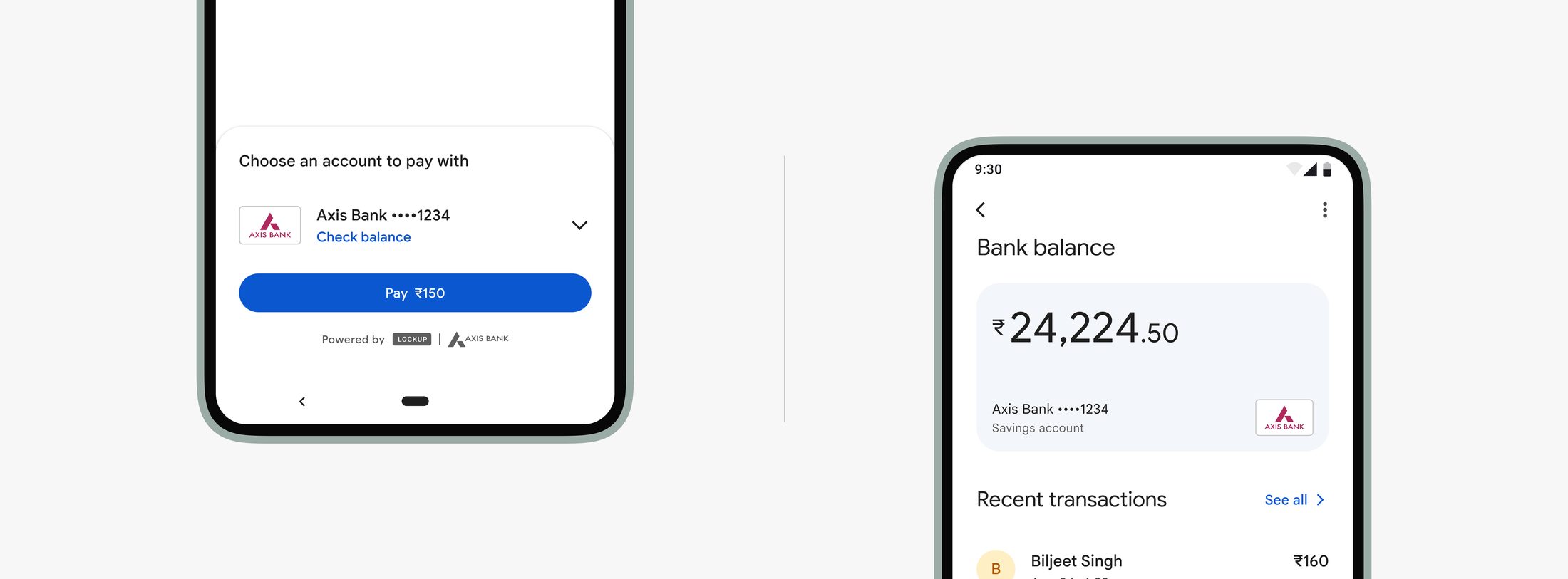
Before Payment
Users often checked their balance from the home screen before making a payment, a moment of reassurance before committing. The team also saw that a meaningful portion of payment failures were due to insufficient funds. So beyond redesigning the main Check Balance screen, we focused on making balance information more accessible within the payment flow itself, helping users stay confident and in control.
We added Check Balance inline, replacing account metadata to reduce friction without pulling users out of context. The loading state appears seamlessly in place, while errors are surfaced with snack-bar messages.
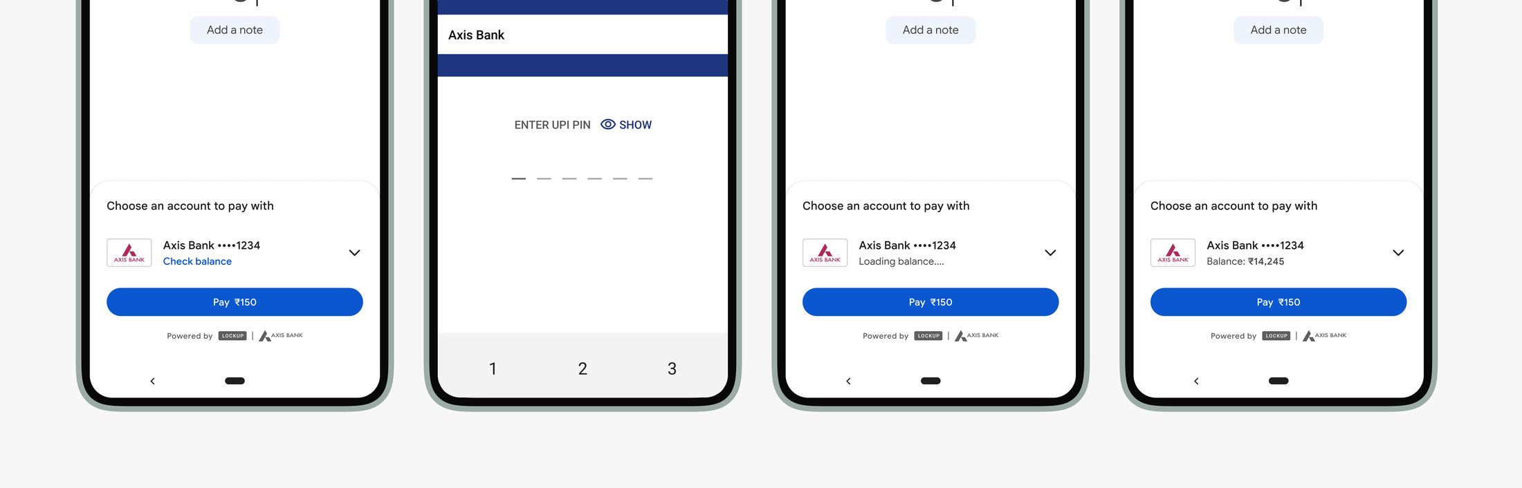
If balance fetch fails repeatedly due to incorrect PIN, we chose to simply disable the Check Balance button, keeping the focus on completing the payment and allowing users to either proceed or switch accounts without adding unnecessary complexity to the payment flow.
From home page
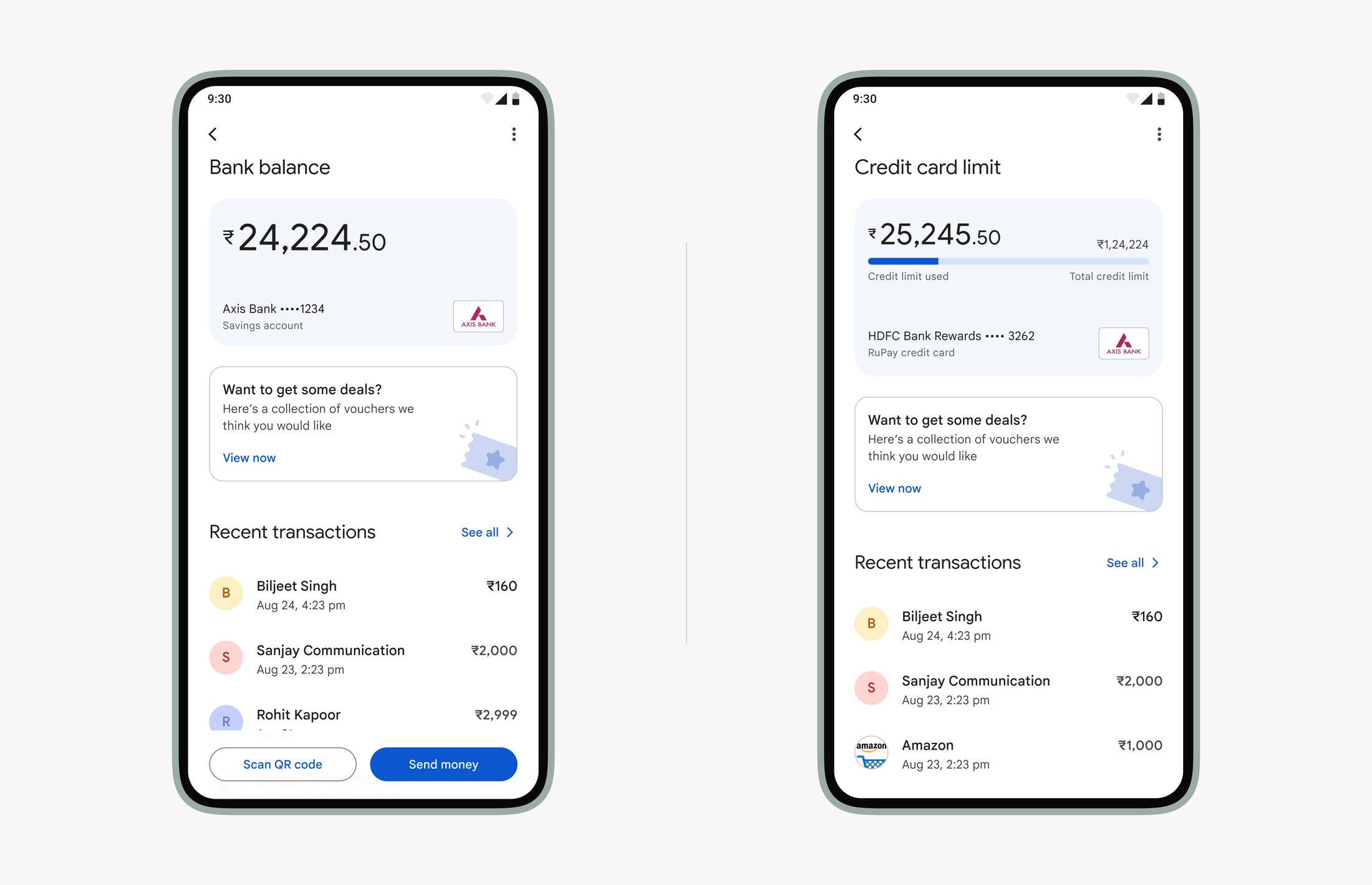
This is where most users check their balance.
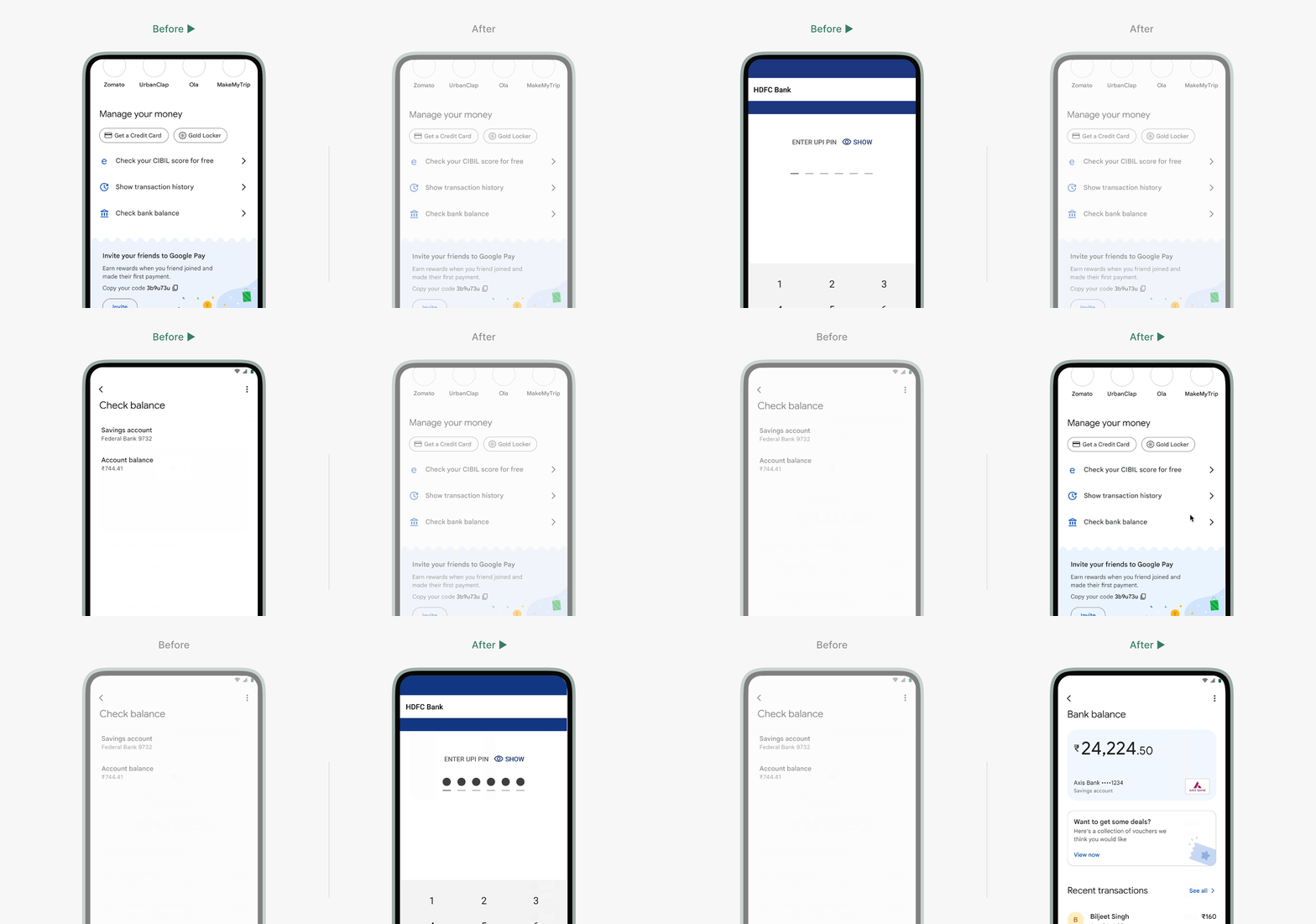
The earlier Check Balance screen was quite basic, showing just the amount in plain text. In the redesign, we focused on elevating the visual experience, placing clear emphasis on the balance, adding recent transactions for context, and including payment options that often follow right after checking the balance.
Loading Screen
Surprisingly, the loading flow for this screen became a major point of discussion. We wanted to show the balance as quickly as possible, while also accounting for users with multiple linked accounts.
Early explorations tried to combine loading and account selection on the same screen after tapping Check Balance from the home page. But those attempts either leaned toward over-designed and engineering-heavy solutions, or ended up feeling glitchy and unpolished.
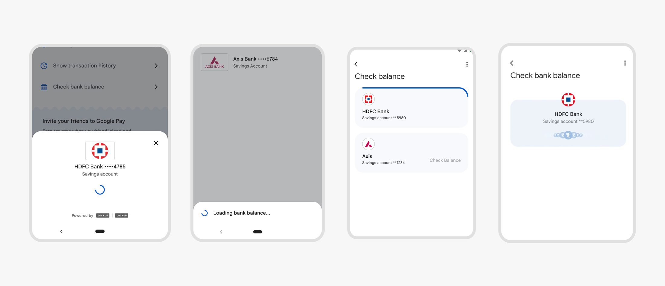
While designing the loading screen, our goal was to make the experience feel quick and responsive, given how essential this utility is. Triggering a skeleton loader immediately on navigation helped set the right expectation and made the flow feel snappier.
Beyond Payment Success
After a user completes a payment, they arrive at a moment of reassurance and ideally, delight. This screen serves two key purposes:
- To confirm the transaction was successful and accurate
- To act as proof of payment, easily shareable with the other party
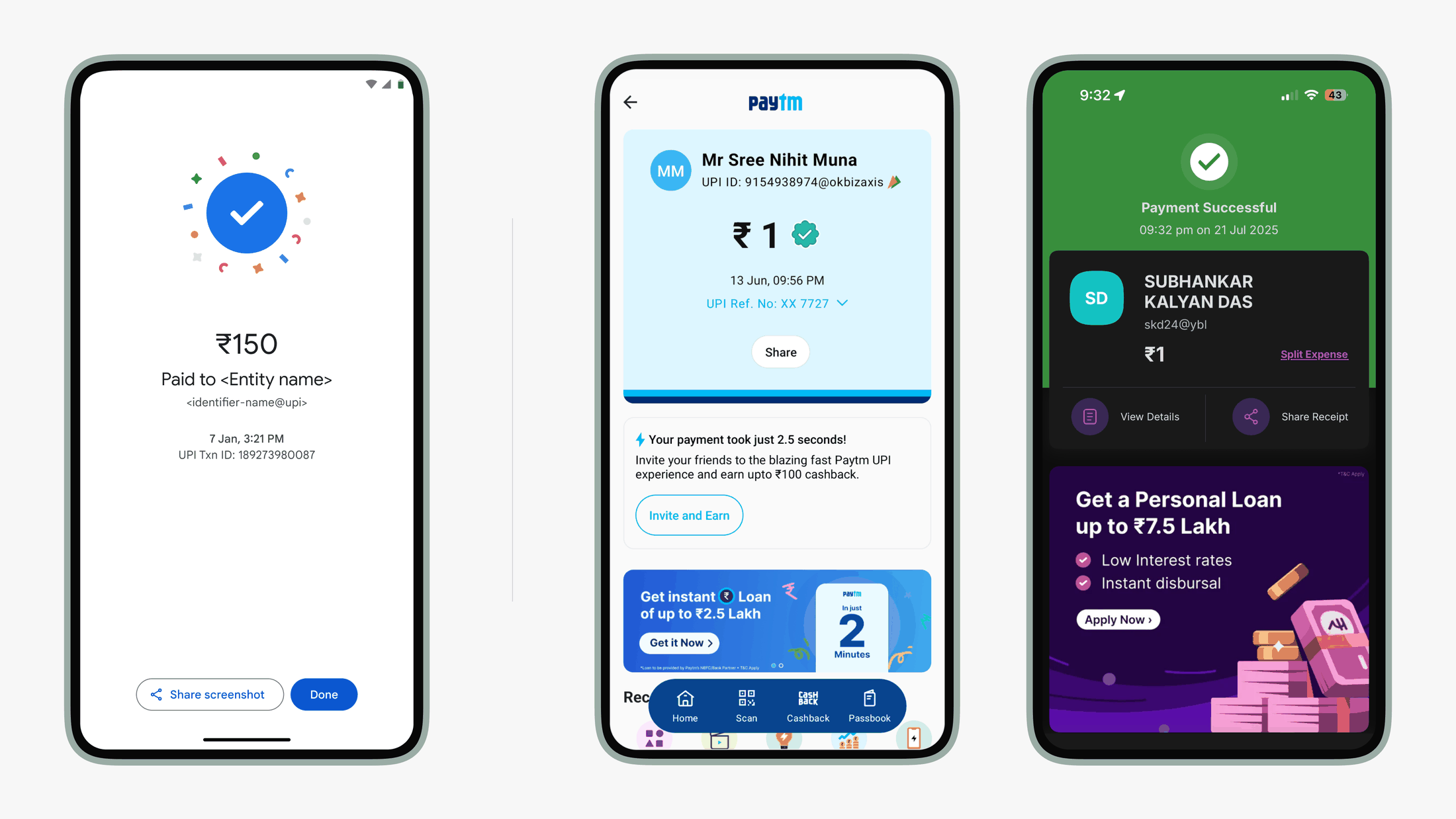
The goal of this project was to build a framework that made better use of the success screen, beyond payment success to offer more meaningful support in the moment and guide how relevant, contextual features can live on the success screen.
Understanding use cases
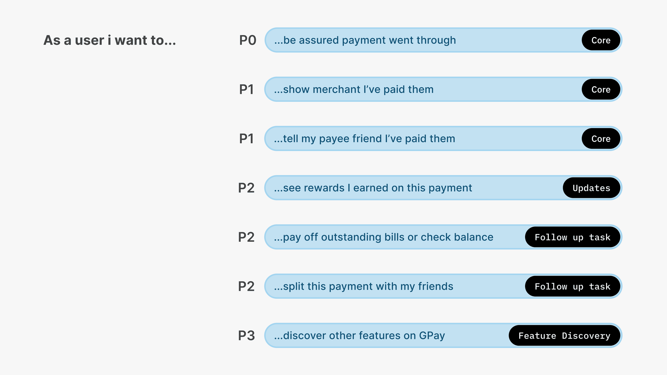
User attention varies widely depending on the payment context. Scanning a QR code at a busy shop is very different from making a payment at home. That meant we needed to be more intentional about what we surface and when.
To guide this, we mapped different categories of use cases and their priorities, which helped us decide how relevant and contextual features could show up meaningfully on the success screen.
Outcome
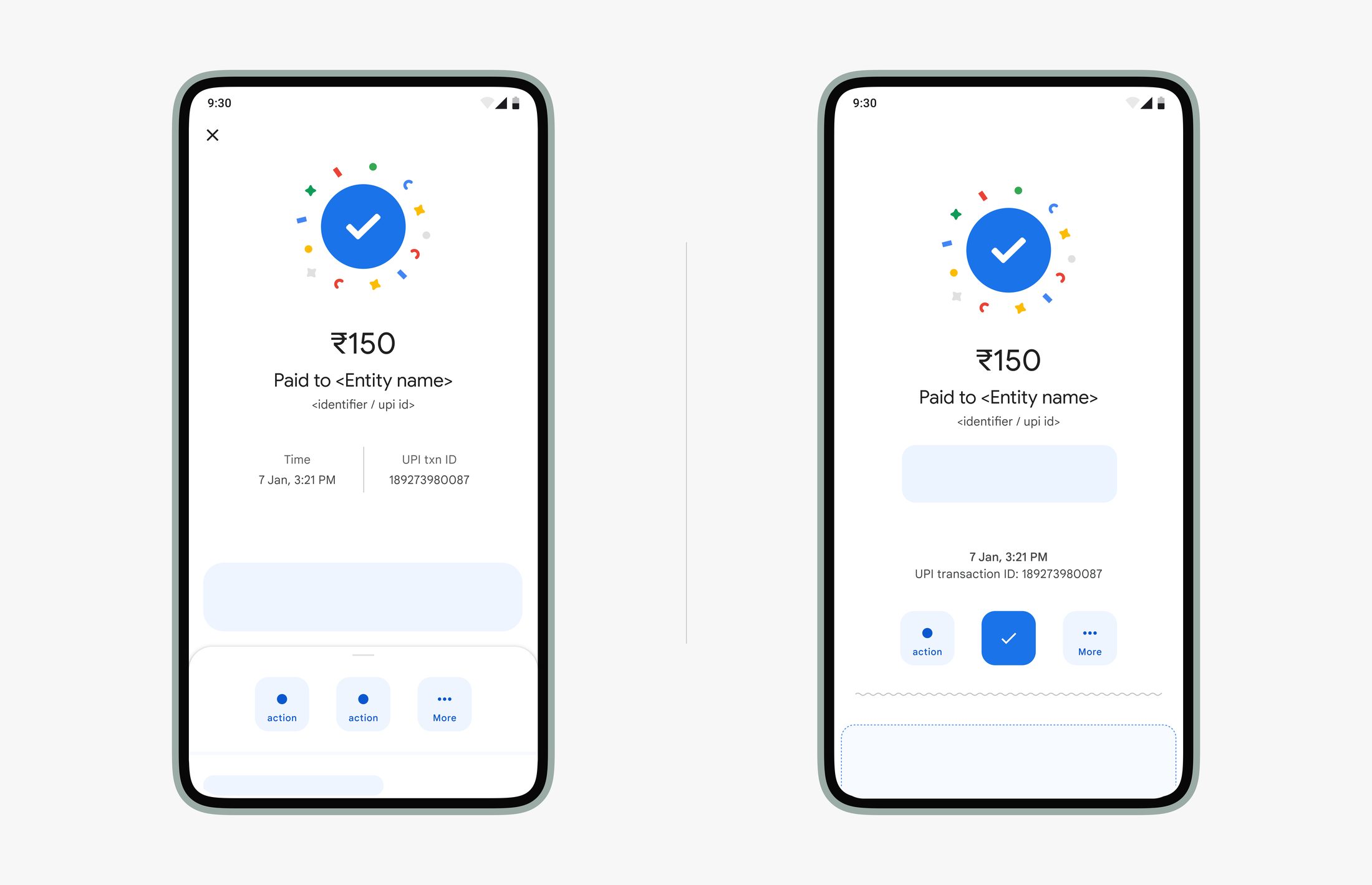
After exploring several patterns, we proposed an expandable sheet as the surface to support use cases beyond just payment success. It allowed us to offer more without overwhelming the user in that moment.
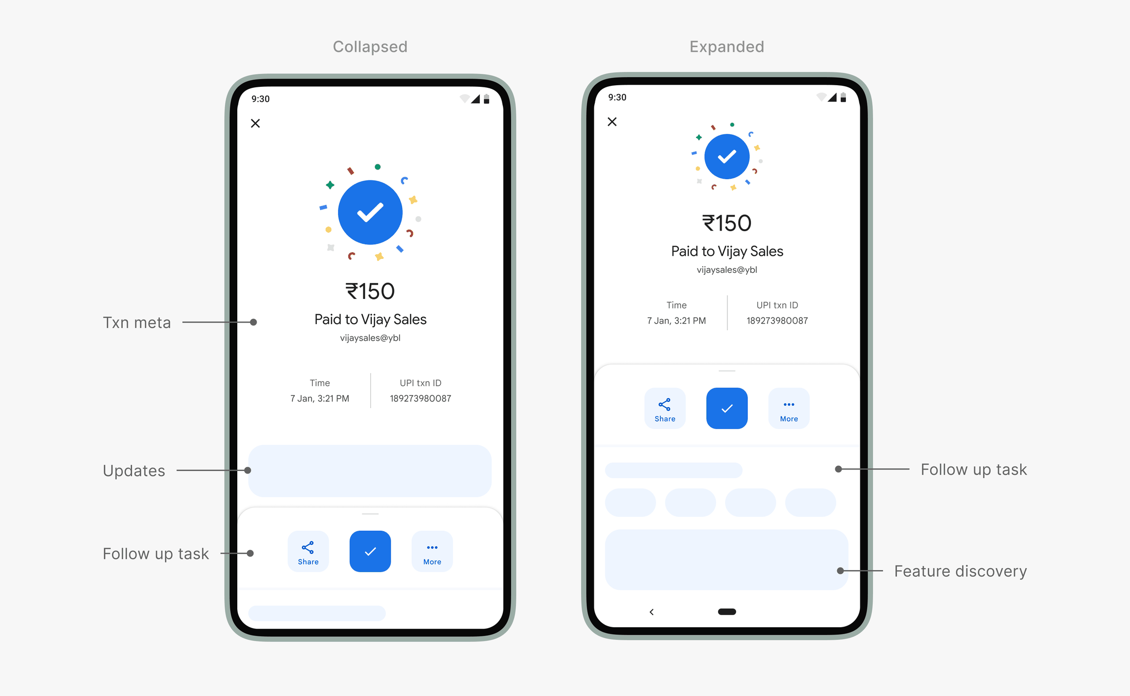
Transaction Info & Success (P0 & P1): The core transaction details were retained with slight layout adjustments. When the sheet expands, this section compresses just enough to maintain context.
Updates (P2): We reserved the area just above the sheet for timely updates like rewards or points, since these are closely tied to the transaction and best surfaced nearby.
Follow-up Tasks (P2): The upper half of the sheet was fixed to highlight quick follow-up actions, followed by a flexible section designed for slightly more involved tasks, such as bill payments.
Feature Discovery (P3): The rest of the sheet became a space for lightweight feature discovery, allowing users to explore more without distraction.
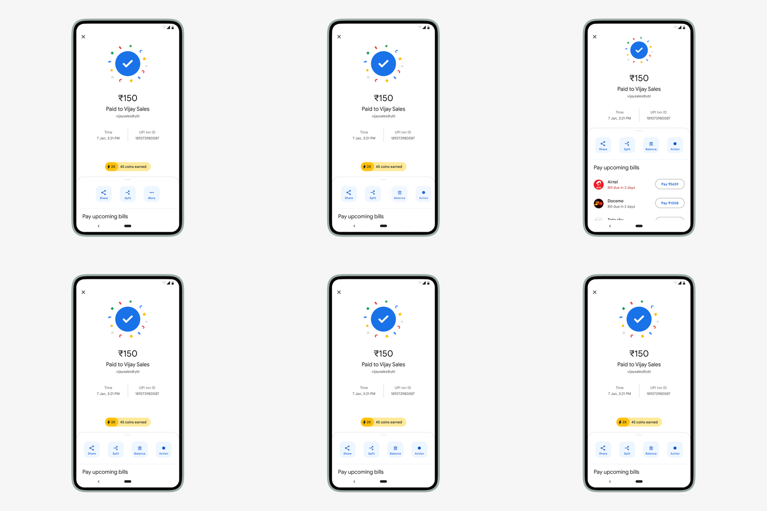
While designing this, we knew that the payment success cue would always be the most important element for users. Everything else needed to stay secondary. A progressive reveal felt like the right balance, allowing the team to surface helpful post-payment actions without taking away focus from the core moment of success.
Transaction History
As volume transactions scaled rapidly in India, the team recognized the need to strengthen the foundation for how transactions were represented, designing a more robust, flexible framework that could grow with evolving use cases and metadata.
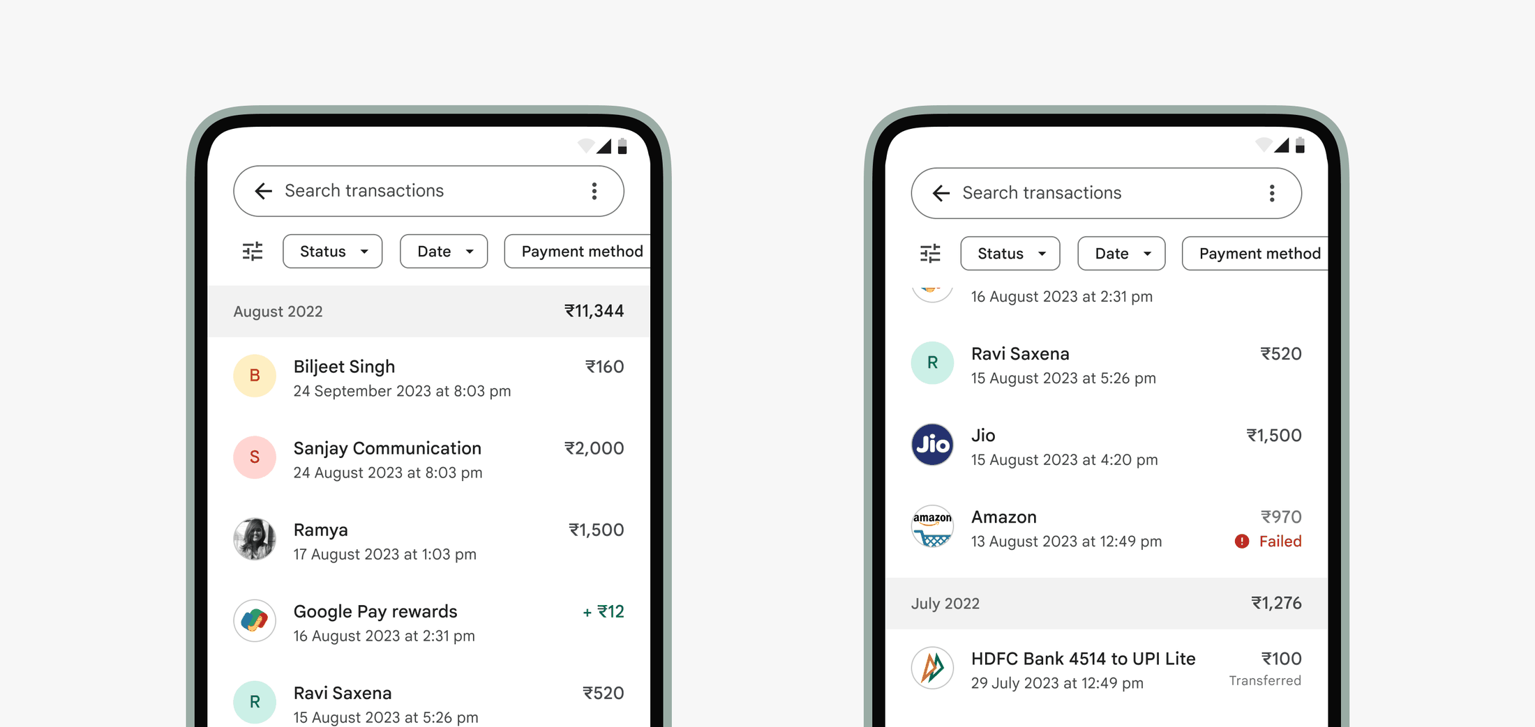
This effort went through several shifts, from imagining GPay as a home for all transactions to focusing on those made within GPay. What remained steady was the intent to make the experience clearer and more helpful. Here’s how we explored, designed, and phased the updates.
Transaction list item
We started with low effort updates, cleaning up metadata to bring more clarity to transaction details while making space for new payment types like Autopay and EMI.
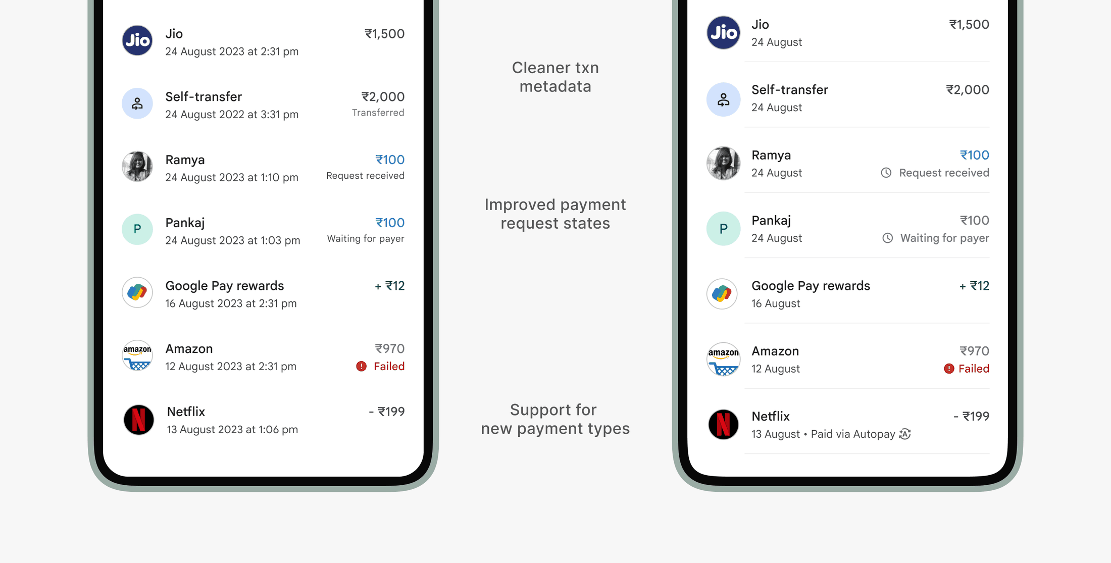
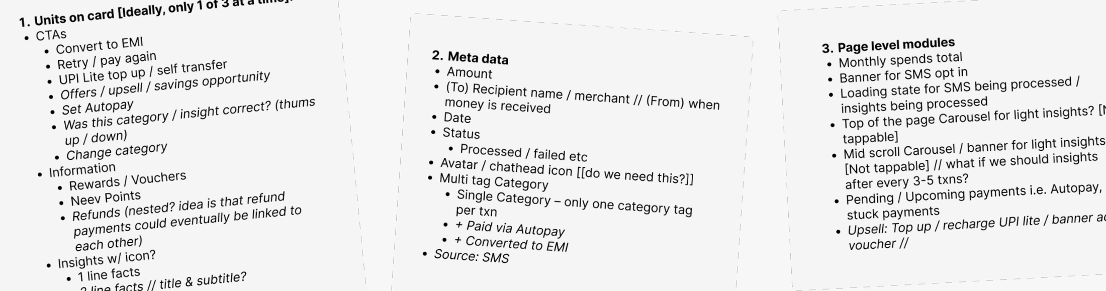
We audited all the metadata available and narrowed it down to just the essentials, grounded in how users actually use the page. Transaction history is often the quickest way for users to validate a payment, check on a pending or failed transaction, or share proof when needed.
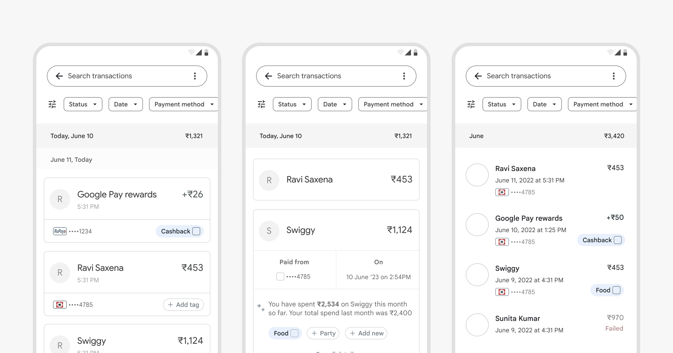
In early explorations tested with users, we found that showing too much information upfront in each list item didn’t add much value. Instead, users preferred seeing more transactions at a glance. Many came in with a rough idea of the amount or date they were looking for, and some relied on search or filters to find what they needed more efficiently.
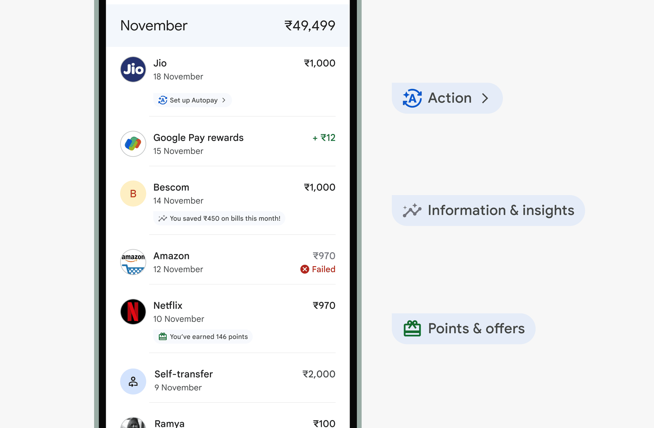
After refining the metadata, we introduced a way to highlight transactions that offered more value, whether it was a reward, a useful insight, or a follow-up action like converting to EMI or setting up Autopay.
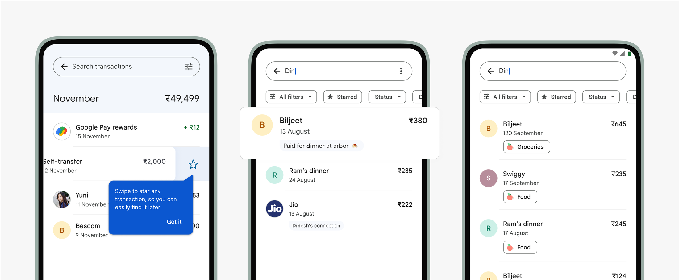
We also introduced simple utilities like starring transactions, surfacing notes added during payment flows in search, and showing spend categories, so that finding and recalling specific transactions felt easier and more personal.
Page updates
What followed were explorations to update the overall page, making space for spending insights, scheduled payments, and other emerging payment types. The broader goal was to shape GPay into a home for the majority of your payments.
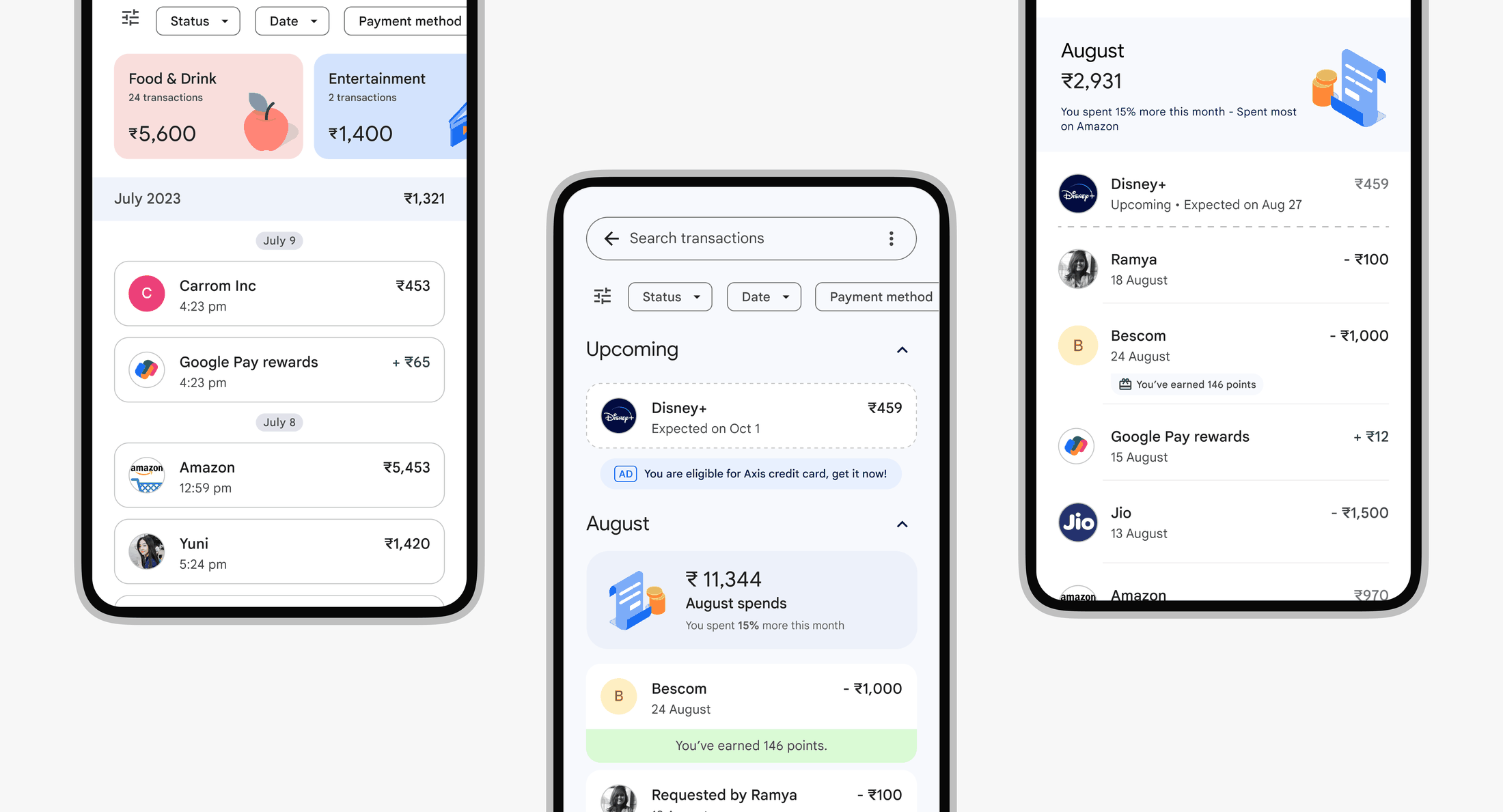
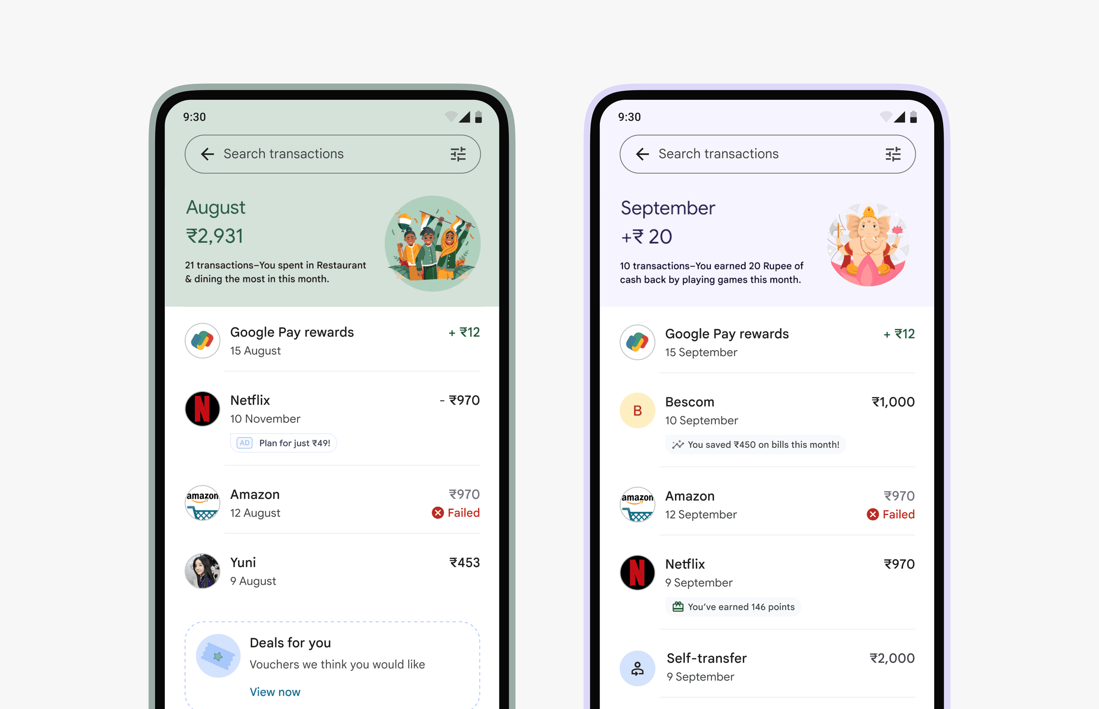
The emphasis was on categorizing spending and summarizing it over time, with the hypothesis that giving users a clear view of their expenses would encourage them to move more of their transactions to the app.
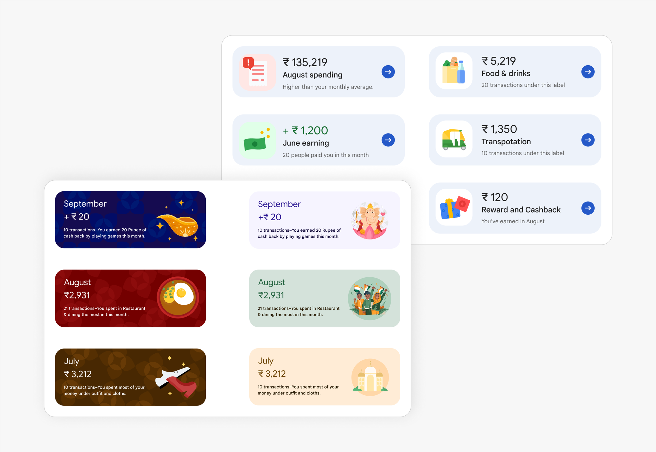
For Phase 1 though, the team aligned on making minor updates to the page, repositioning filters based on usage data and adding monthly spend summaries, while the engine for spend tagging was being developed and refined.
QR Education
There was a small cohort of active users who hadn’t granted camera permission to the app. The team hypothesized that the existing permission screen didn’t clearly communicate why camera access was needed. To address this, we designed a more visual experience, using an illustration to show a typical QR scan scenario and make the value clearer.
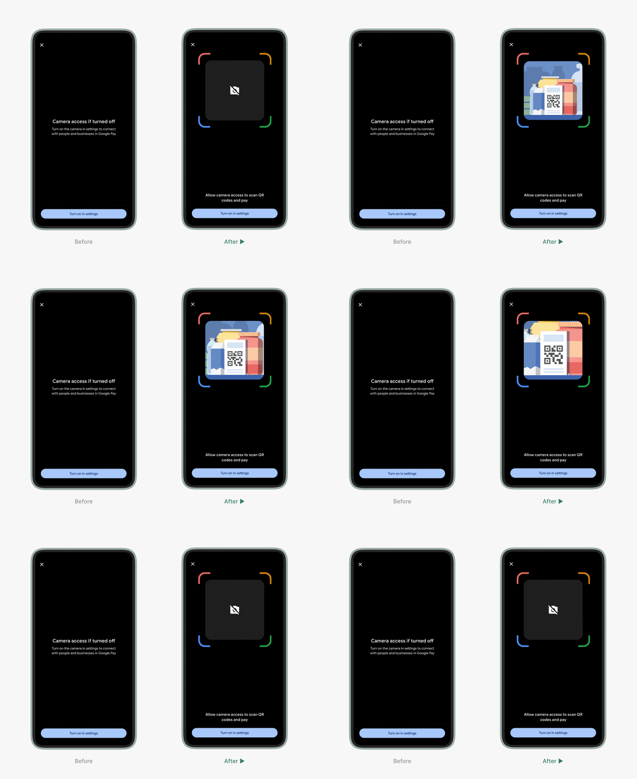
Another data point showed that some users who landed on the QR scan screen didn’t end up scanning, suggesting the purpose wasn’t always clear. In retrospect, closer user observation would’ve revealed more, but it still felt like a useful addition for onboarding new users.
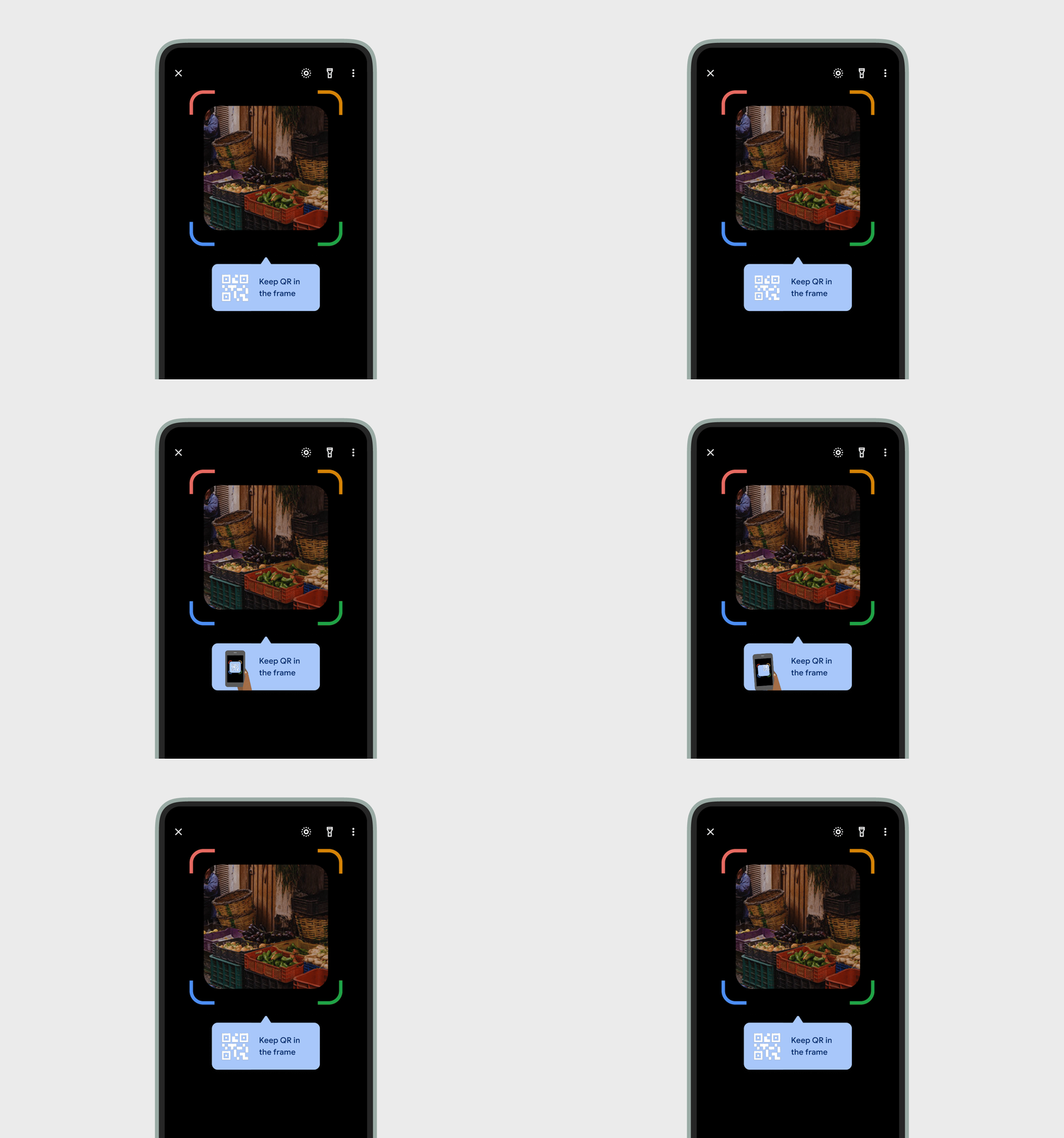
To address this, we explored an extended tooltip with an animated asset to guide users more clearly. The team eventually settled on a simpler tooltip, as the effort required didn’t justify the expected impact.
Payflow Tweaks
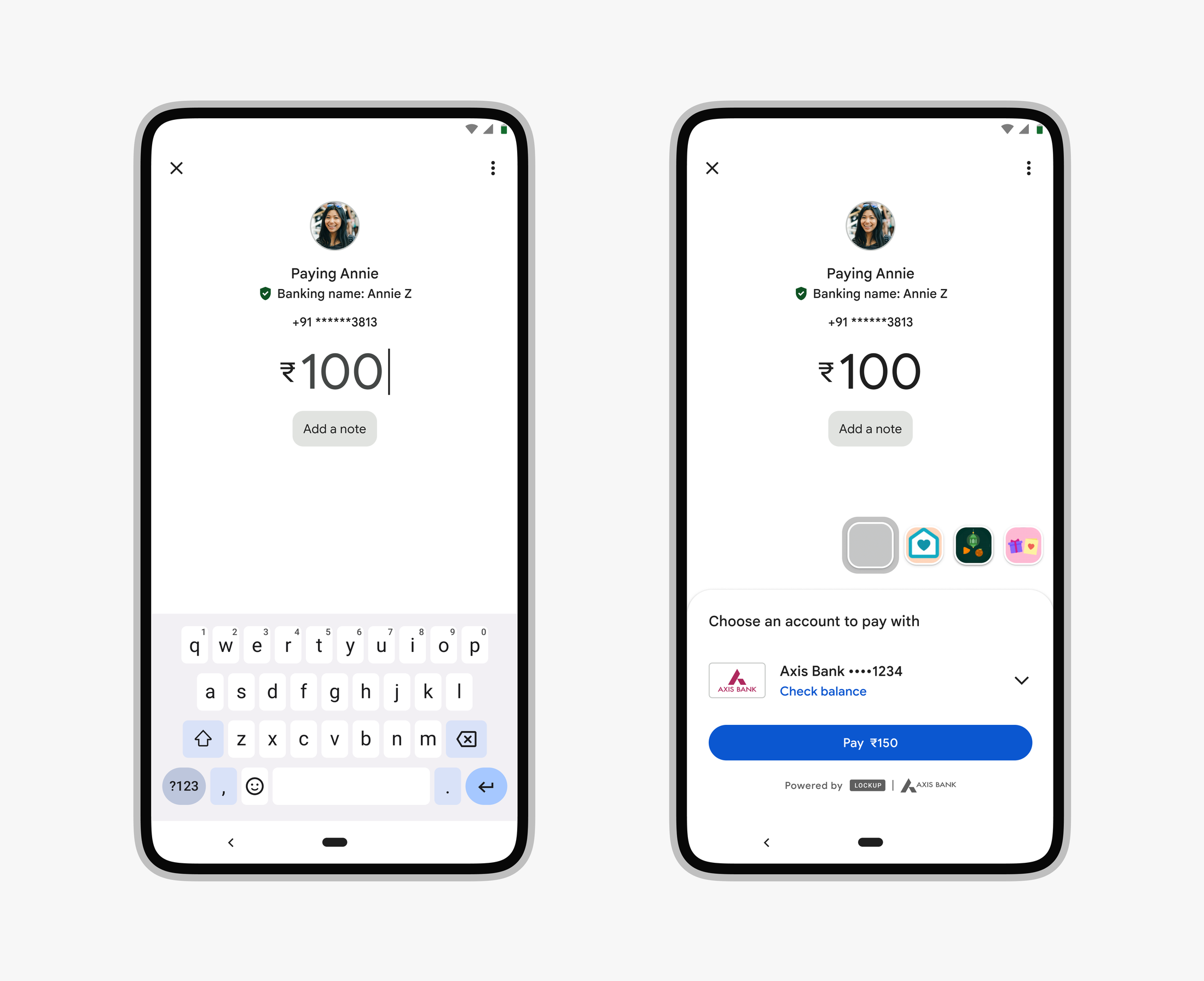
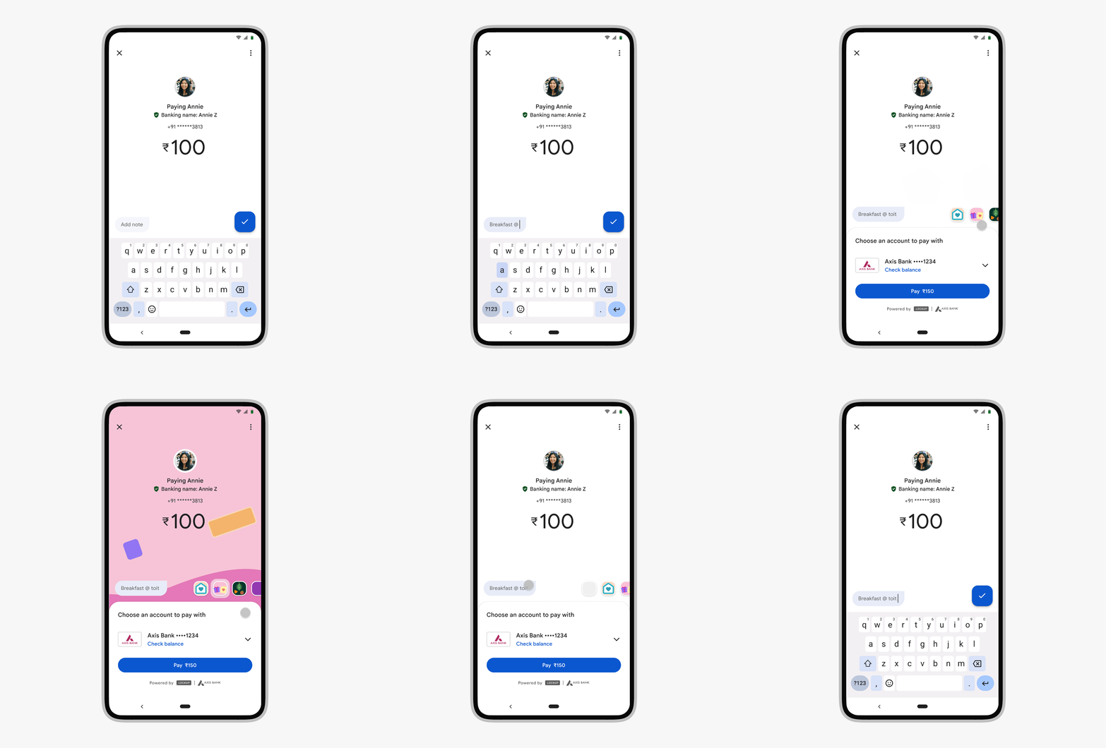
A small percentage of users were using notes on Gpay, and an even smaller number were using wrappers. The issue with the design was that, even though these features weren’t used frequently, notes were placed at the same level of importance as core details like the payment amount, while wrappers often felt too visually heavy on the screen.
Outcome
We proposed toning down the notes field by placing it closer to the keyboard. Wrappers were then horizontally stacked with the note container, grouping all optional user inputs together. This helped keep the main payment details in focus.
Looking Back
Genuinely enjoyed working with Chhavi, Leena, Preeti, Michael, Urshita, Evnisha and Mrirani. Sharp people, easy to collaborate with.
Wish I’d stuck around longer to see how the projects played out, but it meant a lot to get to work on one of India’s biggest payment apps.