Obvious was brought on to help build a design system for Swiggy. I worked alongside Vikalp as a two-person design team. The project began right as the team was transitioning its visual language from 3.0 to 4.0, giving us a unique opportunity to shape the system alongside the redesign.
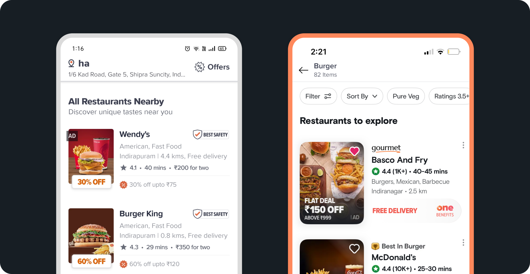
Food Delivery and Beyond
Since 2019, Swiggy has grown from a popular food delivery app into a platform offering a wide range of services to over 20 million monthly users across 500+ cities in India. By the end of 2022, six different offerings were brought together under one super app. This shift called for a design system that could flexibly support the needs of multiple verticals, while staying cohesive and scalable.

Challenge
The team was starting to feel the weight of UI development bottlenecks and extended QA and design review cycles. Without a shared, reusable set of components, teams often found themselves revisiting the same UI challenges, which slowed down momentum across the board.
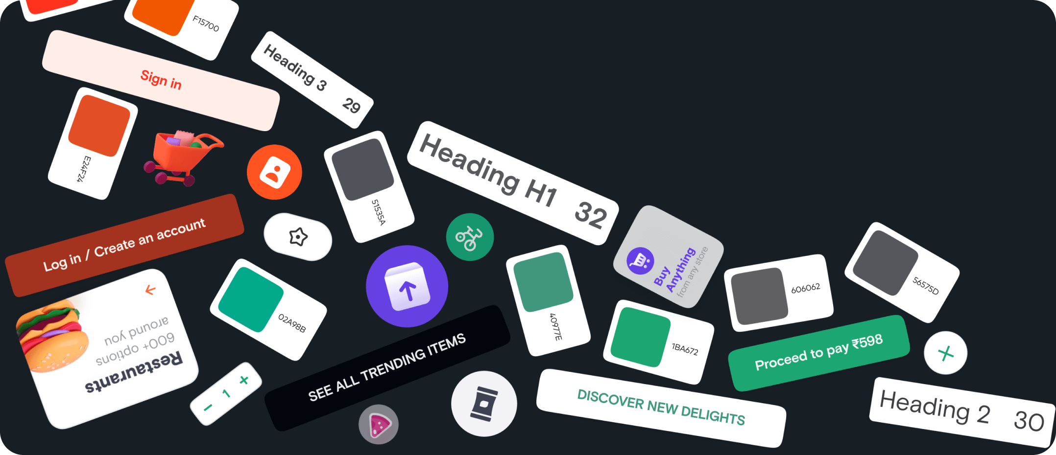
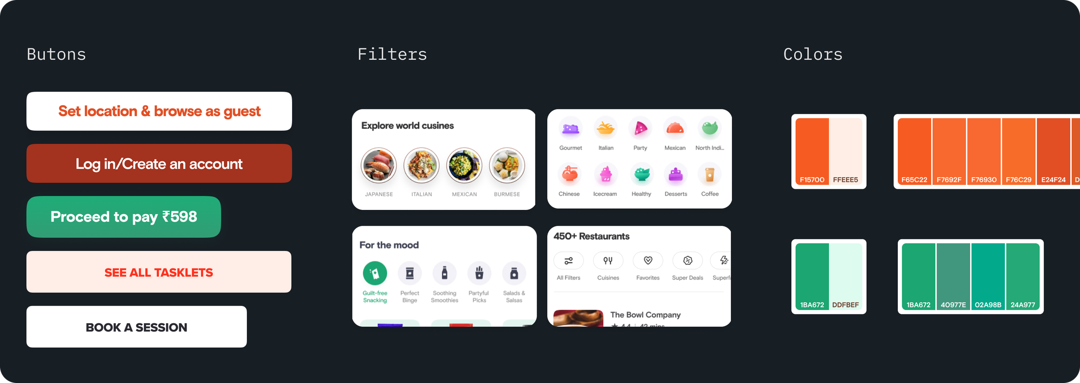
During our audit, we noticed a lot of variation in how similar problems were being solved across the app. The Swiggy 4.0 design had several different manifestations for the same UI needs. This showed up in things like buttons, components, colors, and text styles. This would have continued to create friction for both design and development to move faster—even post redesign.
Approach
To bring clarity, consistency, and efficiency to Swiggy’s evolving design landscape, we landed on a three-part approach. To solve for both the foundational and practical aspects of a design system, while also ensuring it could grow with the needs of multiple product teams.
- Foundation – Establishing the core building blocks such as color, typography, spacing, and other reusable styles.
- Component Library – Identifying and designing reusable UI components that could support a range of use cases across services.
- Governance – Creating a lightweight process for contributing, reviewing, and maintaining components over time.
In the next section, I’ll share more about the first two parts and how we approached them.
Foundations
We began by gathering all the text styles used in the 4.0 designs and refining them to create a clear, purposeful type scale—one that had enough variation and could flexibly support the wide range of use cases across Swiggy.
In parallel, we worked with the Swiggy team to define a thoughtful color palette, assigning clear roles to each color.
Defining spacing and elevations was fairly straightforward in comparison.
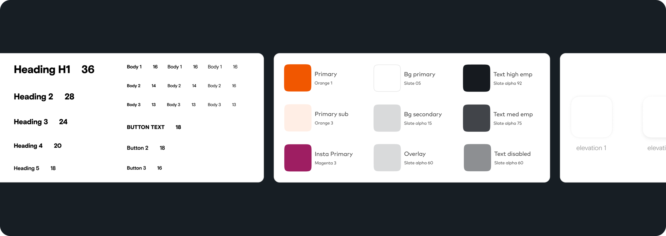
We also introduced a design token methodology across both design and code. This gave us a consistent way to apply colors, text styles, and other foundational elements right from the start. As an added bonus, it laid the groundwork for supporting theming.
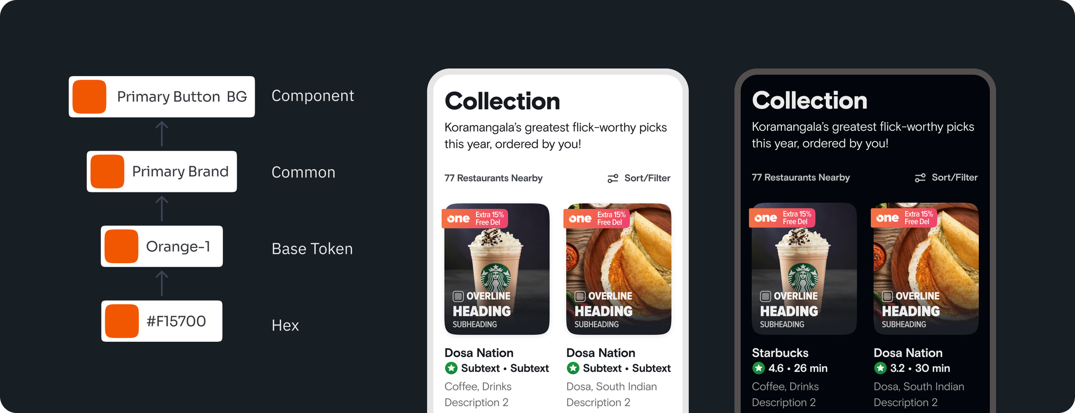
This helped build early buy-in for how design tokens can simplify handoff and speed up UI development. Implementing dark theme became a clear example of this in action, and the right level of constraints would help both design and tech reduce debt over time. The philosophy of purpose over presentation found its first small win.
Components
For components, our approach was to start with a pilot—focusing on the highest-impact component to build momentum, gain leadership buy-in, and demonstrate value to the broader team.
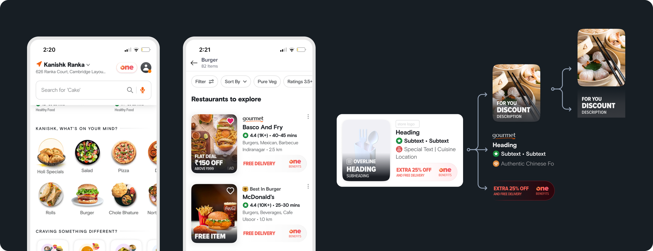
We identified the Store List as one of those components. By extracting its various use cases and breaking it down into building blocks, we arrived at the first set of reusable components for the Swiggy Design System.
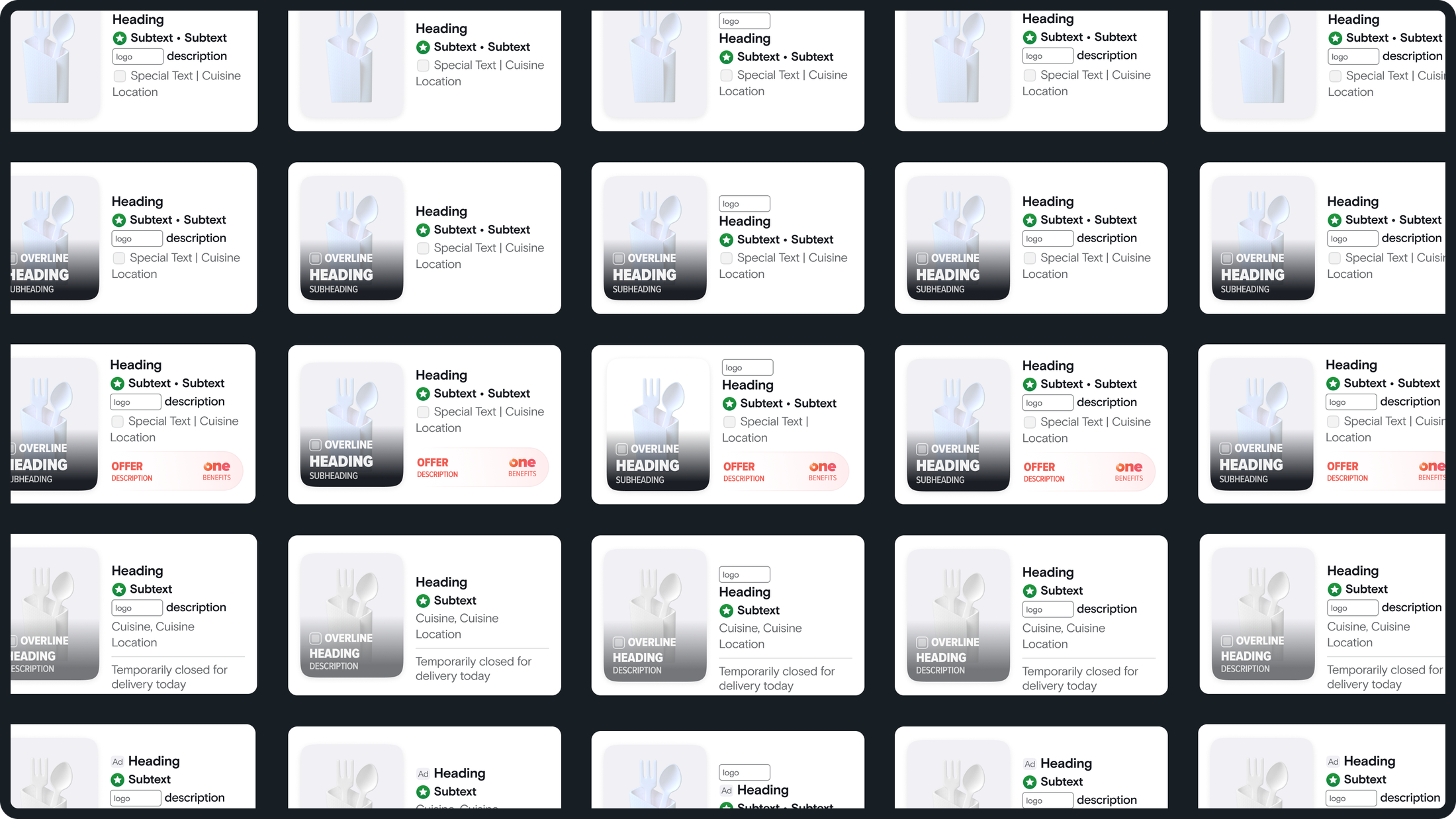
Over the course of the project, we built multiple variants of the Store List component to support a range of business use cases. This made it easier to generate collection pages through server-driven configurations, with a thorough component ready to render all possibilities.
We realised it would have been better to start with smaller, more stable components rather than ones tightly tied to specific business contexts. The latter tend to change more often, while foundational components, though less exciting, offer more long-term stability.
Following this direction, we built out 15+ components across Android, iOS, and Web.
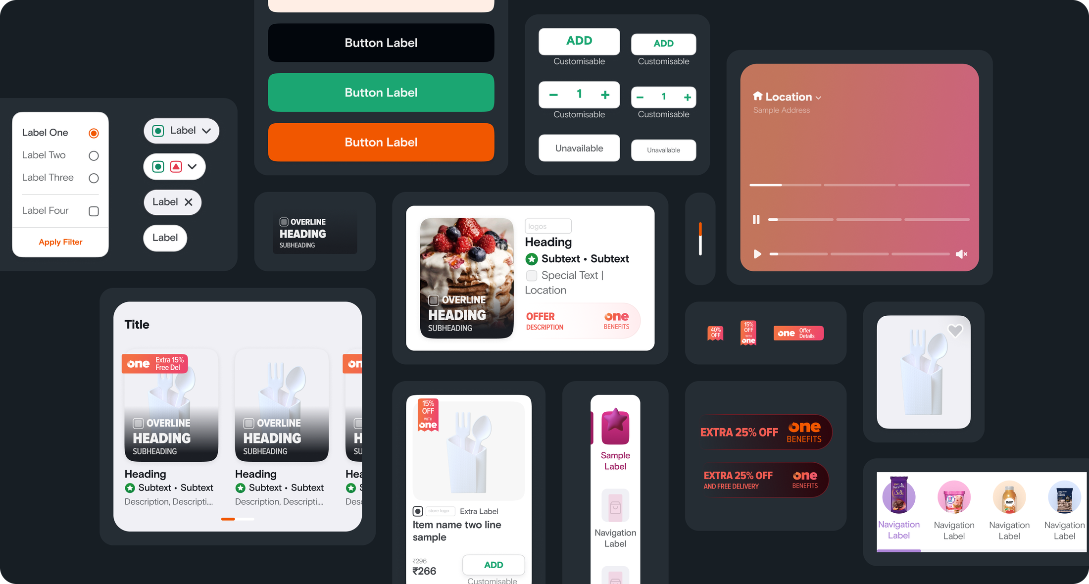
And eventually, we reached a point where the component library was comprehensive—ready for hand-off and for ownership to be transferred to the internal team. It offered foundation that could evolve with the needs of the organisation.
It also became truly reusable across verticals. For instance, the same card component used to showcase restaurants in food delivery was also adopted by another team to display listings in the quick delivery category.
Impact
This had a clear impact on the design and development of collection pages.
Review and handoff time dropped by nearly 75%, and speed of design delivery improved by 30%. It also helped accelerate the rollout of the redesigned experience, which is now live.
This was made possible by introducing polished core components with built-in micro-interactions, accessibility specs, and clear usage guidelines. It meant the team didn’t have to review every small detail repeatedly, freeing up time to focus on more meaningful and exciting problems.
Looking Back
This was my first project where I got to learn the fundamentals of building a design system. We made a few mistakes along the way, especially around component selection, but were able to course-correct once we recognised them.
One key lesson was understanding that not everything needs to be a component. A component only brings real value to a system when there’s clear evidence of it being useful across different teams, not just a gut feeling that it might be helpful someday.
Much of the impact came from the expertise of Vikalp, Sanchita, Gopal, and Meet. It was equally inspiring to watch the Swiggy team shape their bold new 4.0 design language, and we were glad to support that journey.
Design System | Obvious University↗ A guide I wrote from our combined design system learnings.